Tree Item customization
Learn how to customize the Tree Item component.
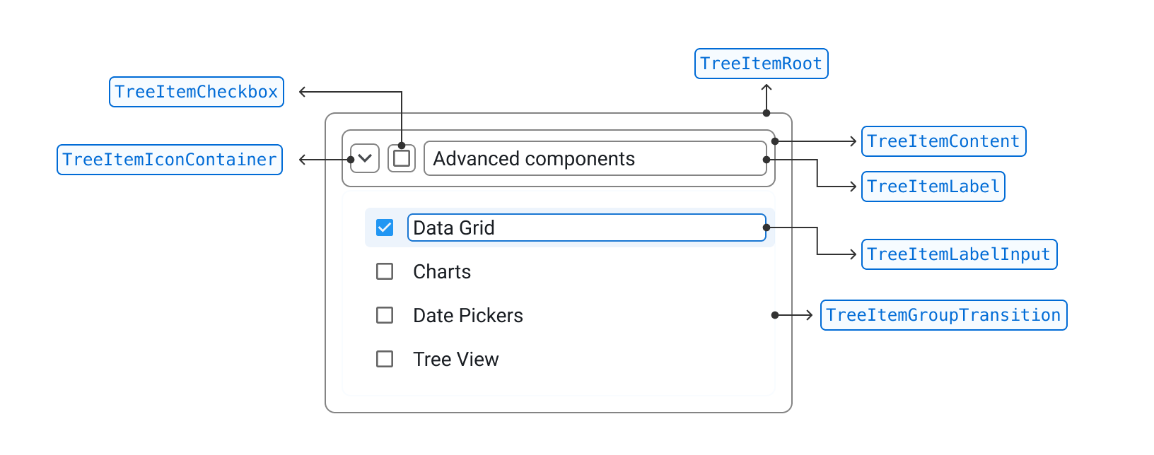
Anatomy
Each TreeItem is shaped by a series of composable slots.
Hover over them in the demo below to see each slot.
Content
Use the content slot to customize the content of a TreeItem or replace it with a custom component.
Slot props
The slotProps prop lets you pass props to the content component.
The demo below shows how to pass an sx handler to the content of a TreeItem:
- Data Grid
- @mui/x-date-pickers
- @mui/x-date-pickers-pro
- Charts
- Tree View
Slot
The demo below shows how to replace the content slot with a custom component.
- Data Grid
- @mui/x-date-pickers
- @mui/x-date-pickers-pro
- Charts
- Tree View
Label
Use the label slot to customize the TreeItem label or replace it with a custom component.
Slot props
The slotProps prop lets you pass props to the label component.
The demo below shows how to pass an id attribute to the TreeItem label:
- @mui/x-data-grid
- @mui/x-data-grid-pro
- @mui/x-date-pickers
- @mui/x-date-pickers-pro
- Charts
- Tree View
Slot
The demo below shows how to replace the label slot with a custom component.
Data Grid
@mui/x-date-pickers
Community package@mui/x-date-pickers-pro
Pro package
Charts
Tree View
Checkbox
The checkbox is present on the items when checkboxSelection is enabled on the Tree View.
Slot props
You can pass props to the checkbox slot using the slotProps on the TreeItem2 component.
- @mui/x-data-grid
- @mui/x-data-grid-pro
- @mui/x-date-pickers
- @mui/x-date-pickers-pro
- Charts
- Tree View
Slot
The demo below shows how to replace the checkbox slot with a custom component.
- @mui/x-data-grid
- @mui/x-data-grid-pro
- @mui/x-date-pickers
- @mui/x-date-pickers-pro
- Charts
- Tree View
Basics
Change nested item's indentation
Use the itemChildrenIndentation prop to change the indentation of nested items.
By default, a nested item is indented 12 px from its parent item.
- @mui/x-data-grid
- @mui/x-data-grid-pro
- Date and Time Pickers
- Charts
- Tree View
Hooks
useTreeItem
The useTreeItem() hook lets you manage and customize individual TreeItem components.
You can use it to get the properties needed for all slots, the status of any given item, or to tap into the interactive API of the Tree View.
Slot properties
The useTreeItem() hook gives you granular control over the layout of TreeItem by providing resolvers to get the appropriate props for each slot.
This makes it possible to build a fully custom layout for TreeItem components.
The demo below shows how to get the props needed for each slot, and how to pass them correctly.
- Data Grid
- @mui/x-data-grid
- @mui/x-data-grid-pro
- Date and Time pickers
- Charts
- Tree View
You can pass additional props to a slot—or override existing slots—by passing an object argument to the slot's props resolver, as shown below:
<CustomTreeItemContent
  {...getContentProps({
    className: 'overridingClassName',
    newProp: 'I am passing this to the content slot'
  })}
>
Item status
The useTreeItem() hook also returns a status object that holds boolean values for each possible state of a TreeItem.
const {
  status: { expanded, expandable, focused, selected, disabled, editable, editing },
} = useTreeItem(props);
You can use these statuses to apply custom styling to the item or conditionally render subcomponents.
- Data Grid
- Date and Time pickers
- @mui/x-date-pickers
- @mui/x-date-pickers-pro
- Charts
- Tree View
Legend
focused
selected
expandable
expanded
disabled
editable
editing
loading
error
Imperative API
The publicAPI object provides a number of methods to programmatically interact with the Tree View.
You can use the useTreeItem() hook to access the publicAPI object from within a TreeItem.
Data Grid
@mui/x-date-pickers
@mui/x-date-pickers-pro
Charts
Tree View
See the Imperative API section on each feature page to learn more about the public API methods available to the Tree View.
useTreeItemUtils
The useTreeItemUtils() hook provides a set of interaction methods for implementing custom behaviors for the Tree View.
It also returns the status of the TreeItem.
const { interactions, status, publicAPI } = useTreeItemUtils({
  itemId: props.itemId,
  children: props.children,
});
To override the default interactions of TreeItem, set event.defaultMuiPrevented to true in the event handlers and then implement your own behavior.
Selection
You can select a TreeItem in a Tree View by clicking its content slot.
The demo below shows how to handle selection when the user clicks on an icon.
@mui/x-data-grid
@mui/x-data-grid-pro
@mui/x-date-pickers
@mui/x-date-pickers-pro
Charts
Tree View
Checkbox selection
By default, checkbox selection is skipped if a TreeItem is disabled or if disableSelection is true on the Tree View.
You can create a custom handler for the onChange event on the checkbox slot to bypass these conditions.
The demo below shows how to implement custom checkbox selection behavior.
- @mui/x-data-grid
- @mui/x-data-grid-pro
- @mui/x-date-pickers
- @mui/x-date-pickers-pro
- Charts
- Tree View
Visit the corresponding RichTreeView or SimpleTreeView docs, respectively, for more details on the selection API.
Expansion
By default, a TreeItem is expanded when the user clicks on its contents.
You can change the expansion trigger using the expansionTrigger prop on the iconContainer.
For more details, see Expansion—Limit expansion to icon container.
Use the handleExpansion interaction method for deeper customization of the TreeItem component's expansion behavior.
The demo below shows how to introduce a new element that expands and collapses the TreeItem.
- Data Grid
- @mui/x-data-grid
- @mui/x-data-grid-pro
- Date and Time pickers
- Charts
- Tree View
Label editing
The useTreeItemUtils() hook provides the following interaction methods relevant to label editing behavior:
const {
  interactions: {
    toggleItemEditing,
    handleCancelItemLabelEditing,
    handleSaveItemLabel,
  },
} = useTreeItemUtils({
  itemId: props.itemId,
  children: props.children,
});
See Editing—enable editing using only icons for more details on customizing this behavior.
useTreeItemModel
The useTreeItemModel() hook lets you access the item model (the object passed to props.items):
const item = useTreeItemModel(itemId);
Data Grid
@mui/x-date-pickers
Community package@mui/x-date-pickers-pro
Pro package
Charts
Tree View
API
See the documentation below for a complete reference to all of the props and classes available to the components mentioned here.